+46% Revenue Growth — CPO Website Redesign
How I led a full UX and UI redesign for CPO Outlets’ e-commerce platform, improving product discovery, decision confidence, and conversion in a complex, spec-driven power tools environment.
Project Overview
CPO Outlets is a web-only retailer selling both new and reconditioned power tools. Their catalog is large and highly spec-driven, making information architecture, search, and comparison critical to the experience.
CPO came to us during a period of declining online performance despite operating in a growing tools market. The site worked reasonably well for expert users but struggled with product discovery, onboarding new customers, and supporting confident purchase decisions. The goal was to redesign the full e-commerce experience — from search and navigation through product detail pages — to help users quickly find the right tools and buy with confidence.
Impact & Results
The redesign launched ahead of CPO’s peak holiday season. Post-launch results showed significant improvements across every key metric.
post-launch
post-launch
with optimization
reduction
My Role & Responsibility
I was the sole designer on the project, partnering with a UX researcher who led interviews and usability testing. I owned the end-to-end experience strategy and design — defining research questions, synthesizing insights, and translating them into product direction, interaction models, and UI. I also led prototyping, execution, and stakeholder alignment.
User Research & Strategy
Defined research questions, synthesized insights, and translated findings into product direction and design principles.
Design Execution & Prototyping
Owned interaction design, visual design, and prototyping across the full e-commerce experience.
Client Partnership & Team Leadership
Led stakeholder alignment and ensured insights quickly turned into shipped outcomes.
Discovery
We began discovery to understand why performance was lagging — not just where it was down. The CPO team lacked deep user insight and relied mostly on high-level Google Analytics. Search and navigation drove high bounce rates, PDPs were missing critical information, and customers had to call support for basic tasks.
Research Methodology
We recruited 12 participants across three segments: frequent customers, occasional customers, and new customers. Each participant completed a 30-minute conversational interview followed by a 30-minute remote usability testing session with screen sharing and think-aloud protocol.
Users weren’t learning about tools on CPO. Over 50% relied on YouTube reviews, 40% followed DIY communities on Instagram, and 20% used Pinterest for ideas and tool guides.
56% of users turned to Amazon to compare reviews and search for the latest styles. 70% used Google to compare prices on other websites — leaving CPO during their purchase journey.
Users couldn’t compare products side by side, increasing cognitive load and slowing decisions. They had to open multiple tabs to evaluate similar tools.
First-time buyers lacked guidance, reducing confidence and increasing abandonment. Users needed 3–5 tries to find the right product, and large result sets without clear prioritization led to analysis paralysis.
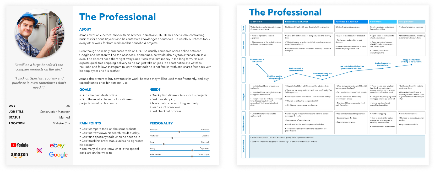
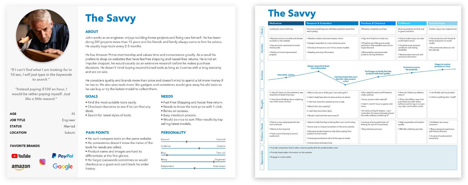
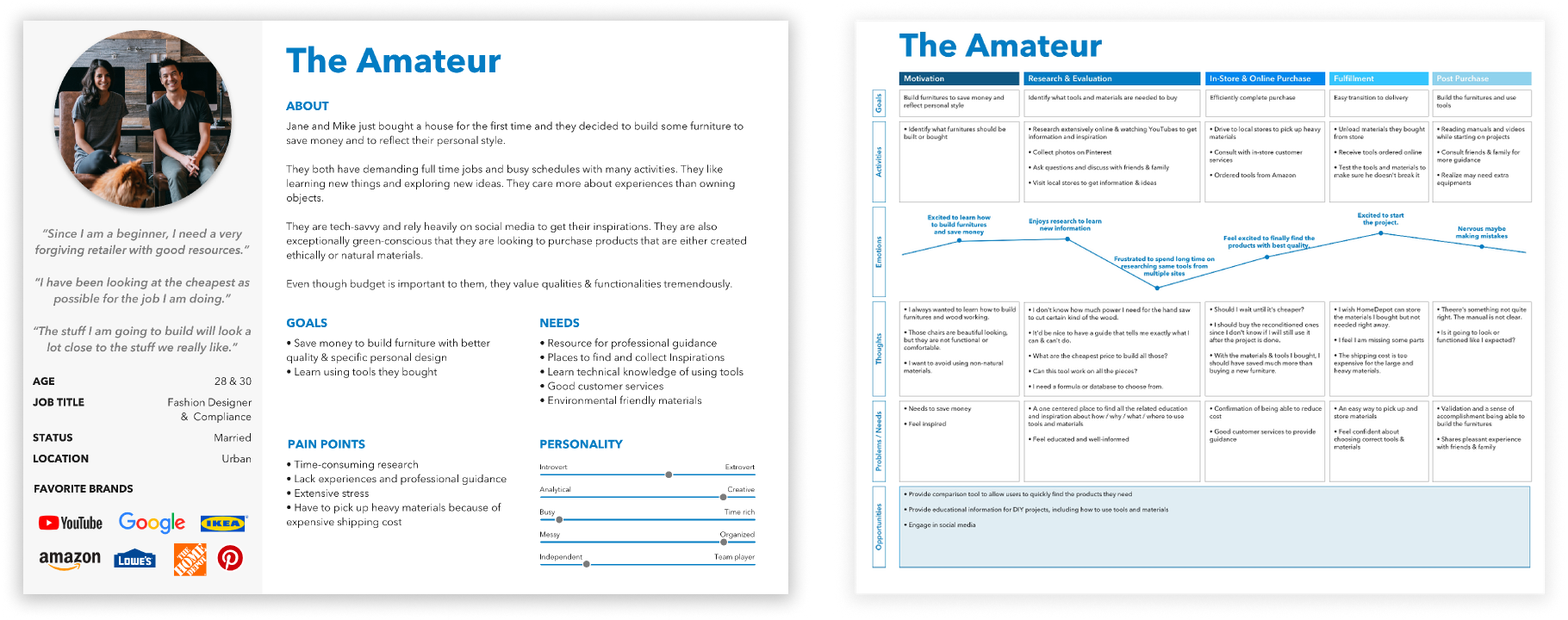
User Personas
Based on research, we defined three core personas to guide design decisions. Experienced users cared most about brand, durability, and reliability, while amateur users focused more on price and felt overwhelmed by options.
Vision
With these insights, we aligned on a clear vision: to make CPO not just a place to buy tools, but a trusted destination where users can quickly find the right tool for their needs.
“Our vision for CPO Outlet website is to be the destination where not only can users buy tools online, but also learn about new tools. When users think about CPO Outlet, they know they can trust CPO to help them quickly find the right tools that match their needs.”
We translated that vision into three guiding questions: how to improve shopping efficiency, how to increase engagement and trust, and how to better educate new users without slowing experts down. This led to a focused set of solutions — stronger filtering, improved search, product comparison, customizable tool kits, saved products, and a future-facing tool finder.
Design
Rather than walking through the full end-to-end build process, I’ll focus on the key features and strategic decisions that were unique to CPO — particularly how we addressed user segmentation, comparison gaps, and decision-support challenges.
1. Search Redesign
Research showed users were bouncing between search and filters, often needing exact model numbers to find products — which created friction, especially for less experienced users. I redesigned search to be more assistive and intent-driven by surfacing popular categories, related keywords, and product images, while improving suggestion accuracy through cleaner search data.
2. Product Comparison
One of the most consistent pain points was product comparison. Users had to open multiple tabs to compare tools, which was especially frustrating in a spec-driven category like power tools. We introduced product comparison directly on the Product Listing Page, allowing users to scan key features side by side without leaving the flow.
3. Product Detail Page
On the PDP, the biggest issue was information overload without clear hierarchy — especially for combo kits. Key details were buried, and users struggled to understand what was included. I reorganized the page around decision-making: surfacing important features near the product images, structuring specs into scannable tables, and adding sticky tabs for longer pages.
4. Cross-Selling & Alternative Configurations
Many users were looking at a single tool without realizing it was available in different bundles or combo kits that might better fit their needs. I surfaced alternative configurations directly on the PDP — for example, showing how a drill could be purchased alone or as part of a higher-value kit. This created a more natural upsell moment aligned with user intent.
5. Create Your Own Kit
User research showed users didn’t want a fixed combo kit. Some already owned tools, and others wanted to build a kit based on a specific job. Instead of forcing them to leave the page, I designed a “Create Your Own Kit” experience directly on the PDP — surfacing compatible products and letting users customize their setup in context.
Reflection
Ship impact under constraints
The biggest constraint was balancing ambition with budget and timeline. We couldn’t launch the full tool-finder in phase one, but we scoped deliberately and shipped a strong core experience in time for the holidays — which drove meaningful revenue impact.
Quality is a shared responsibility
This project reinforced the value of early cross-functional alignment. Involving design, engineering, and stakeholders upfront helped us manage scope, reduce risk, and make better tradeoffs.
Design for long-term scalability
As a consultant, it also reminded me to design for long-term flexibility — building scalable foundations so the product could evolve beyond the initial launch.
This project was completed as a consulting engagement, where I served as the lead product designer responsible for end-to-end UX strategy, research synthesis, and design execution.
About Jocelyn →