+23% Conversion YoY — Top Navigation & Product Listing Page
How I redesigned UNTUCKit's global navigation and product listing experience to drive record-breaking holiday sales, improving wayfinding, product discovery, and conversion across desktop and mobile.
Project Overview
UNTUCKit's existing top navigation and product listing pages hadn't been updated in years. Analytics revealed high bounce rates on category pages, low engagement with filtering, and a growing gap between mobile and desktop conversion. The navigation architecture was dense and difficult to scan, causing users to abandon before discovering relevant products.
The goal was to rethink both the navigation and PLP as a connected system — simplifying the path from browsing to purchase while creating a scalable framework for seasonal merchandising and future category expansion.
Impact & Results
The redesign launched ahead of UNTUCKit's peak holiday season. Results after the first quarter showed meaningful improvements across every key business metric.
year over year
increase
growth
These results validated the design decisions we made throughout the process — from the simplified navigation hierarchy to the improved product grid layout and filtering system.
Research
To understand how customers browse apparel categories, I combined analytics review with heuristic evaluation and competitive analysis. In parallel, I built the user research practice from scratch—leading audits, interviews, and usability tests—and translated those insights into practical, user-centered solutions. These insights informed a simplified navigation structure focused on speed of discovery.
Over-categorized links and inconsistent menu structure.
Returned irrelevant results.
Not enough filter attributes, and missing sorting & color swatches.
The store-availability experience feels incomplete because users cannot complete the purchase digitally.
Global Navigation Design
The redesigned navigation moved from a dense mega-menu to a cleaner, category-focused system. We restructured the taxonomy to reduce top-level categories, introduced curated “shop by” entry points, and gave sub-categories more descriptive labels. On mobile, the nav became a full-screen drawer with progressive disclosure.
Product Listing Page
We explored multiple directions for the PLP — testing different hypotheses around grid density, filter placement, and product card content. The final design uses a clean product grid with a collapsible filter sidebar on desktop and horizontal scrolling chips on mobile. Contextual filters surface different attributes per category.
User Testing
We validated the designs through moderated usability testing across desktop and mobile.
Participants completed task flows for category browsing, product filtering, and navigation wayfinding.
Very intuitive.
Usability Test — Top Nav
It feels more like a retail website.
Usability Test — PLP
Self explanatory — you can see the categories exactly if you’re looking for.
Usability Test — Top Nav
I really like this, I think this will make it a lot easier to find exactly what it is that I’m looking for on that item.
Usability Test — PLP
A lot cleaner and easier to maneuver.
Usability Test — Top Nav
I think using as many filters as we can eliminates the clutter when you’re zoning in on one specific item.
Usability Test — PLP
It’s less work — the fact that I have to go back in and select the actual fit with the dropdown, it’s just clunky. But with buttons, I see everything right away, and it’s very clear to me what’s available and what isn’t.
Usability Test — PDP / Buttons
This is exactly why I didn’t like the dropdown — I have to get the combination right in order to figure if it is available in-stock. It’s a lot of clicking.
Usability Test — PDP / Buttons
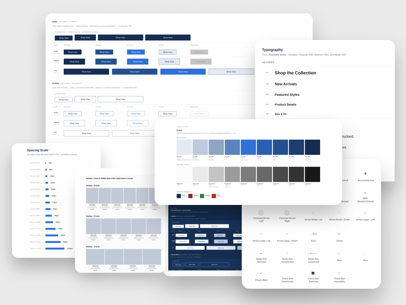
Design System
Alongside the UX redesign, we refined the visual language — updating typography, spacing, and color usage to create a more premium, cohesive browsing experience. The style guide ensured consistency across navigation, product cards, filter components, and mobile touch targets.
Reflection
This project reinforced the importance of treating navigation and product listing as a connected system rather than separate components. The biggest wins came from simplifying the category hierarchy — giving users fewer, clearer choices at each level.
Working directly with the CEO and CTO allowed us to move fast and make bold decisions. The cross-functional collaboration between design, engineering, and merchandising was key to launching ahead of the holiday season and delivering measurable business results.
The redesigned framework continues to serve as the foundation for seasonal merchandising updates, A/B testable layouts, and future category expansion.
This project is part of my work as Senior Director of Product Design at UNTUCKit, where I lead the direction of e-commerce user experience and design operations.
About Jocelyn →